
You’ve written some compelling copy for your website. Your product images are polished. Your overall site design is professional. Since you’re executing marketing initiatives, you’re getting traffic to your site.
There are several reasons why this may be the case, with the most common being that the website is not optimized for conversion. There are several reasons why few website visitors are converting into leads and customers, the most common reason being that the website is not optimized for conversion.
I hear about issues like this every day. It is not enough to simply build a website – you must also take measures to ensure that your visitors take the desired action when they are on your site. A combination of well-designed elements is necessary to capture conversions online.
There are many chances to make errors on your website that could result in a loss of customers. There are a few possible reasons why you’re having trouble getting buyers to convert on your website. Maybe you’re making one of the following mistakes that causes visitors to leave without buying anything.
Reasons People Leave Your Website
Before trying different strategies to attract customers, you should first figure out why you’re struggling to sell products, and why you have so many unsold items in your inventory. solving a problem always includes figuring out what is causing it and then taking steps to fix that problem. Here are some common reasons why your traffic isn’t converting into sales:
Your design is outdated.
We tend to judge books by their covers, even though it’s not always accurate. In Derek Halpern’s blog “Social Triggers,” he shared a study that showed how a site’s design can impact how trustworthy it is perceived to be.
In a study conducted by Dr. Elizabeth Sillence, participants were asked to rate their level of trust or distrust towards websites discussing the topic of hypertension. In an unexpected finding, the study discovered that 94% of those who were concerned attributed their discomfort to the website’s design.
Design matters. Geocities was a web hosting service founded in 1994 and was later acquired by Yahoo in 1999. If your site still looks like it’s from 1996, it may be time for a professional redesign.
Your content is difficult to read.
On a related note, consider that design isn’t just about colors, images, and graphics. The font choice, color of text and background, can affect how easy it is for people to read and understand the content on your website. If the text cannot be read easily, it will not convert well.
Although there are no definite guidelines to choosing fonts, there is one rule that everyone should follow: never use Comic Sans. The best results come from high-contrast color combinations and clean fonts without any decoration. Here are a few tips and ideas on choosing the right fonts for your marketing.
Larger fonts are better for visitors on both desktop and mobile devices. Use a font size of 22px or larger for headlines. For body copy, stick to 14 px or larger.
Your site relies on outdated plugins.
If your website’s sales content is in Flash files, you will have to wait a long time for users who do not want to install an updated version of this plugin. Even YouTube is using the more modern HTML5 video player instead of the Flash object.
You should use HTML5 for all of your videos and animations. If you want to provide a better experience for users who can’t or don’t want to watch a video, include a summary, notes, or transcript of the video. This will also help boost your SEO.
Even though plugins and add-ons are deprecated often, you should still remember them. The more basic your website is, the less time you’ll spend having to update it to keep up with current trends.
You’re overwhelming people with ads.
If you rely on ads for your website, then you may not be able to remove them entirely. You don’t need to have ads everywhere, just because you need to have ads.
Despite the increasing popularity of online advertising, participants in Nielsen’s 2014 Trust in Advertising report overwhelmingly trusted traditional advertising methods such as newspaper ads, magazine ads, billboards, radio ads, and infomercials more than online banner ads.
Since too many ads can break trust with potential customers, it’s important to limit the number of ads you use and where you display them. Ads shouldn’t be the first thing that visitors see when they go to a website, and they shouldn’t take up more space on the website than the website’s actual content.
The videos on your site auto-play.
I cannot stand it when a video on a website automatically plays. It makes me want to click the “Back” button immediately. Today’s online customers prefer to choose how and when they consume content. If you blast potential customers with information without them asking for it, they will be driven away from your website and you will not make a sale.
Your navigation structure is unclear.
Have you ever arrived on a website looking for a specific piece of information, only to get caught in a seemingly endless maze of poorly laid-out navigation options? If so, raise your hand.
navigation can negatively affect both your website’s user experience and your SEO efforts.
The key to successful navigation design is to think from the perspective of your customer. If you are new to a website, you would expect the information to be organized in a way that is easy to find and understand. What steps would you need to take in order to find information that would answer your questions?
Put your user’s needs first when organizing your navigation to avoid losing sales from poor content organization. If you are not confident that you can rearrange your content according to consumer expectations, you can use a service like User Testing to uncover potential trouble spots. Drunk User Testing may be even better to uncover potential trouble spots.
Your registration requirements are obtrusive.
If you have gated content on your website, it can help drive leads into your sales funnel. If you restrict everything with gating and registration requirements, your conversion rate will suffer.
When you are creating opportunities for people to register, think about whether every field you are adding is necessary. After Expedia removed a single data field, they earned an extra $12 million.
Your site lacks personality.
The personality of your brand is important on your website and in your marketing campaigns.
There is a relationship between how brands present themselves in different countries and how strong the consumer relationships they make are.
Across cultures, businesses succeed when their employees have strong personalities. If your website does not have a unique voice, you will have difficulty connecting with potential customers. Your sales will suffer without that connection.
Lack of trust
There has been an increase in the number of scams taking place, so it is not surprising that people have become more cautious about being scammed. People need to feel like they can trust your store before they purchase anything from you online. If they’re not able to find what they’re looking for quickly, they’re likely to leave your Shopify store and not come back.
The eCommerce store is not mobile-friendly
People are now using mobile devices for everything from messaging friends to paying bills. This includes shopping from online stores. If you want to generate traffic and sales to your Shopify store, you need to optimize your site for mobile users.
Targeting the wrong market
You may be tempted to try to sell your products to as many people as possible to get as much traffic as you can. But that’s not possible. Not everyone will be interested in buying your product. It is important to target the right audience for your product by optimizing your SEO and paid ad strategies, so that the right demographics are attracted to it.
Unappealing landing page
The food was all gone within minutes The section of your website that a user arrives at after clicking on an ad, email, or any other location on the internet is called the landing page. This is where users will develop their first impressions of your online store. If your landing page is not interesting or attractive, people are less likely to buy things from your store.
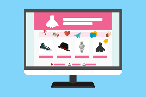
Poor image quality
People want to see the products they are potentially interested in buying. If you are unable to show potential customers images of your product, they will be less likely to buy it from your online store. The pictures/images should be high quality as well, so that potential customers can see the details of the products you are selling.
Unclear Call-to-actions
Your call-to-actions should be persuasive and clear so that buyers notice and pay attention to them. You need to create a website banner that catches people’s attention and is memorable. To make something stand out, you can use colors that contrast each other and make the text large.
To sum it up, CTA’s need to be:
- Written in a legible font
- Communicating the benefits of the product
- Using contrasting colors and a clear design
Lack of reviews
One way to ensure the credibility of your Shopify store is to have good reviews. Customers will always be looking for proof that you’re not trying to scam them, and they’ll usually find this in the customer reviews on your site. If there are no food sources for them, then they will leave.
Poor navigation
As a business owner, you want your customers to have a favorable experience when they visit your online store. There are a few things you can do to make sure that their experience is a positive one. The goal is to make sure that users can find what they’re looking for easily and without any hassle. The goal is for visitors to be able to navigate the site easily and find the information they need without difficulty. If your potential customers get frustrated with your website, they will be less likely to buy your product or come back.
Poor product descriptions
You need to describe your products in an enticing way to encourage people to buy them when they visit your store. If you don’t have great product descriptions, people will not want to stay on your website.
Difficult check-out process
No one wants to be bothered by things that take up unnecessary time. If you make the check-out process too long and complicated, customers will be discouraged from completing their purchases.
The brand doesn’t look professional
Your goal should be to not only sell your product, but also your brand, to people who might not have heard of you before. If you want customers to trust your brand, your website should give off a professional vibe.
Since a website is the best way for you to showcase your brand, there are a few things you need to keep in mind when designing it, so it appears professional:
- Strong brand identity presented in consistent and clear colors and fonts
- Professionally designed logo
- Crisp and clear high-quality images
- Text that is well-organized and easily scannable
Website copy lacks persuasion
It’s important to have website copy because it provides visitors with information about your brand or site. The copy should guide visitors through your website and help them understand what you’re offering.
But creating a website copy isn’t enough. It needs to be enticing, persuasive, and powerful. The best way to write a persuasive letter is to put yourself in the shoes of the buyer and think about how you would be persuaded. You should always keep your target audience in mind.
High shipping costs
Too often, customers abandon their shopping carts when they realize how high the shipping fees are. The eCommerce giants have raised the bar for shipping expectations, now people expect fast and free shipping from any eCommerce store. If you see that more customers are abandoning their carts in your store, it could be because you charge too much for shipping.
Slow shipping and delivery
Buyers prefer it when their packages arrive quickly. People usually think that it will take a few days to a week or two for it to arrive. If your shipping times are longer than three weeks, you will probably lose sales and may even get complaints from visitors.
No use of FOMO
The ‘fear of missing out’ is a psychological phenomenon that drives people to take action immediately. The concept is that you motivate your site visitors to buy your product immediately by informing them that they may take the chance of losing out on an unique collection or a restricted time offer.
If people are in danger of losing something, they will take quick action. Your customers should feel a sense of urgency when they see your CTAs.
THE PROBLEM: YOUR BUSINESS ISN’T GROWING AS FAST AS IT SHOULD!
Your sales have stagnated or decreased, and you can’t figure out why. Discover what’s holding you back from achieving predictable sales growth in your business.
If you want to grow your business, you need a proven plan and framework. That’s what you get with the 2X Your Sales Discovery Session.
Want to learn about a formula for Predictable Growth that will put your business on a 90-day path to 2X Your Sales?