
Businesses in all industries should use content marketing. There are several ways to convince customers to take action on your site, such as writing blog posts, posting social media updates, and sending timely emails.
You can improve your website and brand image by adding more visual content.
The main idea of visual content is images, videos, and GIFs, but it can also include other things. Content like this is a good way to get your audience’s attention and give them something of value. Most of the time, you can convince your viewers to take the next step in the buying process by using visuals.
1. People Remember Visuals more than Written Content
It’s important to use visual content in your marketing because people are more likely to remember your message when it’s presented visually. The written content on your website can have a powerful effect on your visitors, but it is only one piece of the puzzle.
If you want people to remember your brand and come to you with industry-specific questions, you have to make sure you provide them with helpful information.
Infographics and visuals are a great way to keep your brand top of mind for users long after they leave your site. Some studies have found a connection between visuals and memory, but most studies agree that visuals are usually remembered better than text.
2. Consumers Want More Videos
Even though there is an increase in visual media, consumers still want more from business leaders and marketing teams. Almost half of online shoppers say they want more video content in the coming year. As more people get access to smartphones and social media channels that use visual content, we expect the number of people using them to increase.
There are many different types of videos you can create to promote your products and cater to your customers’ needs. We think it would be a good idea to start by figuring out what your target audience’s goals and pain points are. To create videos that are popular, use the information you have learned to answer questions people are asking, offer a how-to guide, or provide a list of tips for your industry.
3. Curated User-Generated Content can Boost Engagement
After that, let’s discuss using visuals with content curation to increase engagement. Collecting feedback and other content from customers and compiling it for existing subscribers and future visitors is essentially what content curation is.
If you have high-quality visuals on your social media feed or website, it is more likely that people will trust your business. Before people shop with a new company, they often look for social proof. Surveys reveal that most online shoppers say they look at reviews before committing to a brand.
When new users find your social media page, they’re more likely to visit your website if they see a list of glowing reviews with images or videos.
4. Images and Videos Help with SEO
If you add images and videos to your website, you will be more likely to show up higher in Google searches, which will result in more people seeing your content and website. Optimizing your visuals for SEO is different from traditional SEO.
Google can’t “see” visuals in the traditional sense. If you want to make sure your image appears in the top spot for your chosen keywords, you need to tell the image search engine what your image is about.
Make sure to pick a key word and use it in the title of your file, the caption for your image, and the alt text. Make sure your alt-text is descriptive.
When uploading a post to YouTube or a website, it is important to use tags to ensure that the post is seen by the intended audience. Adding tags to your visual content can help you generate traffic, especially if you have a new channel or website.
5. Visual Product Demonstrations Highlight Value
Finally, we are going to talk about product demonstrations. What was the last big purchase you made online? Which did you do, buy now or look for a demonstration? Most online shoppers want to see a product in action before they decide whether or not to buy it.
This thought process makes sense. Consumers know they have more options than ever before. A brand must demonstrate that it can offer value before potential customers will even consider becoming customers. If you don’t experiment with how effective your product is, you can be sure that a competitor will experiment with their product first and get more people to use it.
Now, let’s talk about Visual Branding…
The importance of visual branding for businesses can not be overstated. It is important for businesses in multiple ways.
A business’s visuals are the most important aspect in distinguishing it from others in its industry. For example, how many people do you think wouldn’t be able to recognize the Apple or Coca-Cola logos? Exactly.
All you need to know about visual branding
The first step of visual branding is planning. The visuals of a business should have a purpose, be meaningful, and be able to withstand changes in trends. There is no mistaking that trends change.
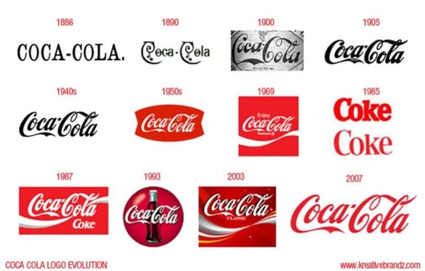
Contrary to popular belief, logos do change over time. Businesses that have been around for a while (like Coca-Cola) have adapted their logos to be more evergreen, but the trick is that they remain equally recognizable after the re-design and finishing touches.
Lufthansa is an example of a company that changed their logo design and color, but remained just as recognizable.


Since the internet is our main source of information, visual branding has taken on a new meaning. Your logo Image will be prominently featured not only on your products, but also in your company’s online marketing campaigns. Therefore, it’s worth it to make it memorable.
Brand identity
Your brand visuals should accurately reflect your business and what it stands for. You can create a proper brand identity by using any strategy that you think works.
Colors and shapes can have their own power. More people are likely to purchase products that are brightly colored red because it is aggressive, whereas light blue is often associated with calming and cheerful family times.
Many brands that are focused on families use light blue in their color palette to emphasize their message. The Oreo logo and campaigns feature a blue color scheme. You can add seasonal banners to your social media profiles for an added effect.
Types of visual branding
As mentioned above, a logo is just the beginning. There are also many other factors contributing to the visual identity of a business. Some common features include:
- Logos
- Typography
- Image styles
- Composition styles
- Memorable color patterns
You need to know your audience in order to choose the right visuals. This means that you should choose visuals that appear appealing to your customers, not just to you. It’s always a good idea to ask for a second opinion.
As successful startups will tell you, it’s often a good idea to ask people who are not experts for their opinion. This holds true for visuals, too. You can learn about what your logo represents to people who are unaware of your brand by asking them what associations your logo brings to mind.
Logos
Some of the world’s most recognizable brands have the simplest logos. They are none the less recognizable for that. A simple logo is easier to evolve than a complex one.
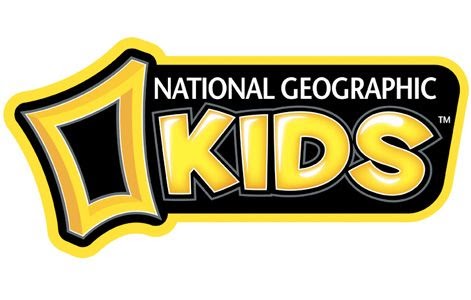
National Geographic is a great example of a company that has expanded internationally while still maintaining its visual identity.
Note the subtle changes in design that are all but logical:

Typography
When it comes to typography, many companies may opt for something with more depth and individuality. You need to be eye-catching without being too complicated. Don’t forget about Marvel when looking at this topic. This design is very specific, with a clean font and a solid background color that is easy to create.
It’s precisely that simplicity that allows for additional experimentation, as illustrated below:
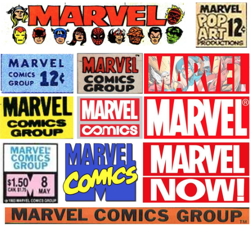
Image styles
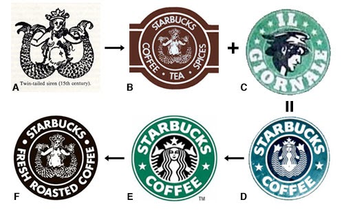
More complex designs are known to evolve. The trick is in keeping them recognizable. You can create a style for your image by defining its look and feel. If you want to make gradual changes, do what Starbucks has done by retaining the original shape and style while making small modifications.
Composition styles
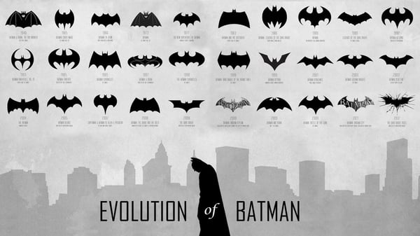
These logos convey competitiveness and sophistication. Some brands have multiple logos that convey a sense of sophistication and competitiveness. This is when mixing various ingredients to create a unique composition style is most important. Batman is the best example of a character who has gone through many changes, but is still recognizable.
Memorable color patterns
Choose a color palette and shapes carefully! If you want your visuals to be effective, you need to be consistent with them over time and not make radical changes. Your visuals need to be recognizable so people can identify your brand, and flexible enough to undergo changes over time.
Dos and don’ts of visual branding
Visual branding is a complex process that doesn’t have to be complicated. Many brands make the mistake of constantly publishing content on their social media profiles.
This is no way to go about visual branding. It is not a good idea to only use one communication channel. For another, quality matters. It is better to have a posting strategy and only provide quality, expert content than to post random stuff just to appear active. The same is true for visuals and written content.
It is important to be consistent all the time. Changing colors, shapes, or typography randomly will not improve your visual identity. It is best to take your time to create visuals that fit your visual branding strategy rather than making small changes only when they are necessary.
Use social media to connect with friends and family in different ways. Design banners, logos and headers for increased online presence. You can promote current offers by changing the banners on your social media pages.
Visual branding elements
How does one create a visual representation of their identity? Most importantly, how can it be done successfully?
Who are you writing for? Think about your audience when you are writing. What do you have to offer that is most appealing to them? What is the defining characteristic of your brand? Since the internet became a staple in society, times have changed dramatically. Visual branding that uses established routines to appear more human and friendly.
The internet has created an invisible barrier that makes the competition fiercer and changes the game. There are so many banners, backgrounds, logos, messages, and videos that it is hard to make your brand seem more human.
If you advertise online instead of using more traditional methods, your sales staff won’t be able to interact with potential customers in person. This could make your brand seem more friendly and caring. Your task will be to communicate the message without using any words.
You can see that creating a visual brand is a complex process that involves making the design attractive, using recognizable colors and patterns. This text is about your business, and it reminds your audience of your business’s promises. It stands out among the competition at all times.
Therefore, let your imagination fly free. Make sure you take your time to compare different designs and color schemes before you commit to anything, that way you can be sure you’re happy with the end result. The future visuals of your project will be determined by the colors, shapes, and typography you choose in the beginning.
The first step is to consider how you want your logo to influence your audience. Should the text evoke an emotional response in the reader, such as feeling touched by the honesty, amused by the cuteness, or serious about the topic? It all depends on who the message is for. The tone of the message should be appropriate for the person who will be reading it. Listen to your audience. Maintain the same tone of voice in your visuals as you do with your written content. The two things are not very different from each other in this way.
Remember what your customers want and always be aware of what the competition is doing. Your visuals must change over time to match both of them.
THE PROBLEM: YOUR BUSINESS ISN’T GROWING AS FAST AS IT SHOULD!
Your sales have stagnated or decreased, and you can’t figure out why. Discover what’s holding you back from achieving predictable sales growth in your business.
If you want to grow your business, you need a proven plan and framework. That’s what you get with the 2X Your Sales Discovery Session.
Want to learn about a formula for Predictable Growth that will put your business on a 90-day path to 2X Your Sales?
